60% of participants struggled to understand membership options at first glance. This finding directly informed the restructuring of membership content and pricing visibility across the site.
Information Architecture
Guided by research, I redesigned the site map and content hierarchy to prioritize membership tiers, clarify benefits, and streamline navigation toward inquiry actions.
Wireframing & Validation
Low-fidelity wireframes and sketches were developed to test layout structure and conversion flows. A usability study validated hierarchy improvements and helped refine clarity before moving into high-fidelity design.
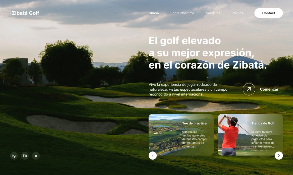
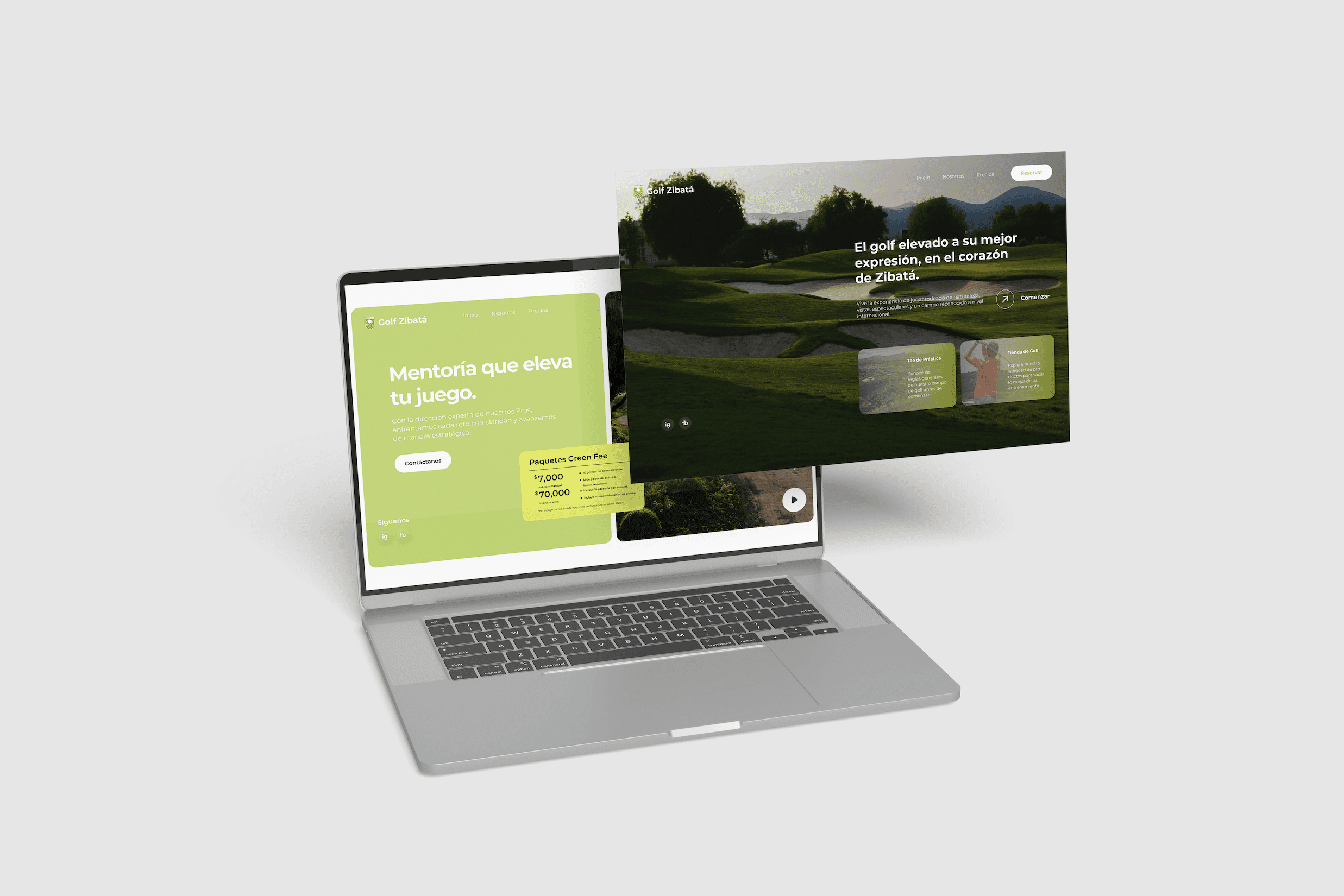
UI System & Final Execution
The final interface translated the brand’s premium identity into a cohesive digital system. Typography, spacing, and visual hierarchy were intentionally crafted to reinforce exclusivity while maintaining usability and conversion focus.